GetPaid with Fincent
A designers case study
Increase in Invoice creation
Improvement in payment collection
Enhanced user satisfaction
Lower rate of overdue/unpaid invoices
Description
This project involved creating a streamlined and intuitive invoicing and payment request system that enhances user productivity and improves the overall financial workflow within the platform.
Problem
Small and medium-sized businesses often struggle with managing cash flow, maintaining financial accuracy, and ensuring timely payments due to inefficient invoicing processes. Existing solutions lack the necessary ease of use, scalability, and integration needed to streamline these critical functions. As a result, businesses face delays in payments, increased administrative burdens, and challenges in maintaining financial health.
My Role
Benchmarking & Competitive analysis
Wire framing
Prototyping
Interaction design
Dev ready visual Design and Mockups
UI Development & collaboration with engineering team
Stake holders
Co-founder (Design lead)
Operations team (Bookkeepers)
Product Manager
Engineering team
Research
To ensure that Fincent's invoicing system would meet and exceed the expectations of its users, we conducted some research. Our research goal was to understand how these platforms organize, create, and request invoices, and to identify opportunities for innovation and improvement.
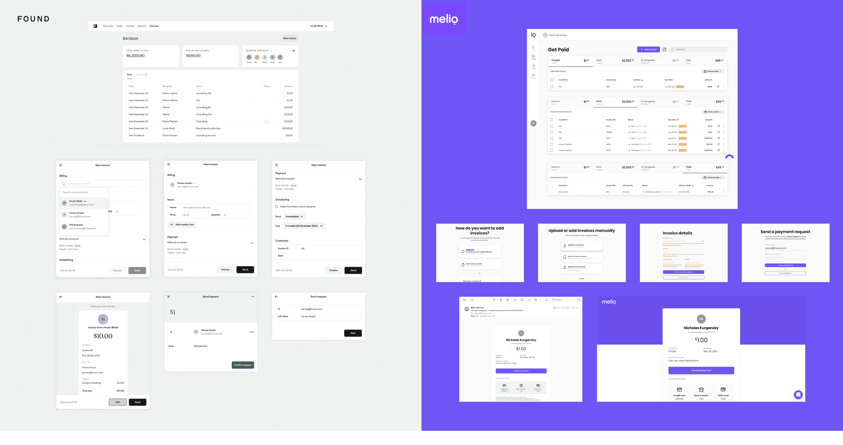
I conducted a thorough competitive analysis and benchmarking of two key competitors: Found.com and MelioPayments.com.
Understood invoicing system of Quickbooks and what api’s are available to be aware of technical constraints
Spoke to bookkeepers, to understand why business owners hate creating invoices in Quickbooks and what are the minimal details required to save invoices and collect payments.
Findings
Invoices are organized by status (e.g., due, paid, overdue), but lacked granular categorization that could help users prioritize their actions more effectively.
Require users to manually track the status of invoices, adding to the cognitive load.
Lacked branding options which are important to build credibility
Lacked control/flexibility of scheduling payment requests, payment processing fee, which are critical for many SMBs.
Insights
Room for improvement in reducing cognitive load when managing multiple invoices.
Our competitors lacked real-time tracking and notifications for invoice status. .
The need for customization, such as including company logos and scheduling payment requests was missing
Design Goals
Based on the insights we defined some goals:
Simplify invoice management: Reduce the cognitive load on users by categorizing invoices and making navigation intuitive.
Improve payment collection efficiency: Increase the rate of timely payments by streamlining the invoice creation and payment request process.
Enhance payment tracking: Provide users with clear, actionable insights into the status of their invoices, ensuring they can easily track payments and overdue invoices.
Branding & flexibility: Support branding and give control of payment preferences at a business and at an invoice level.
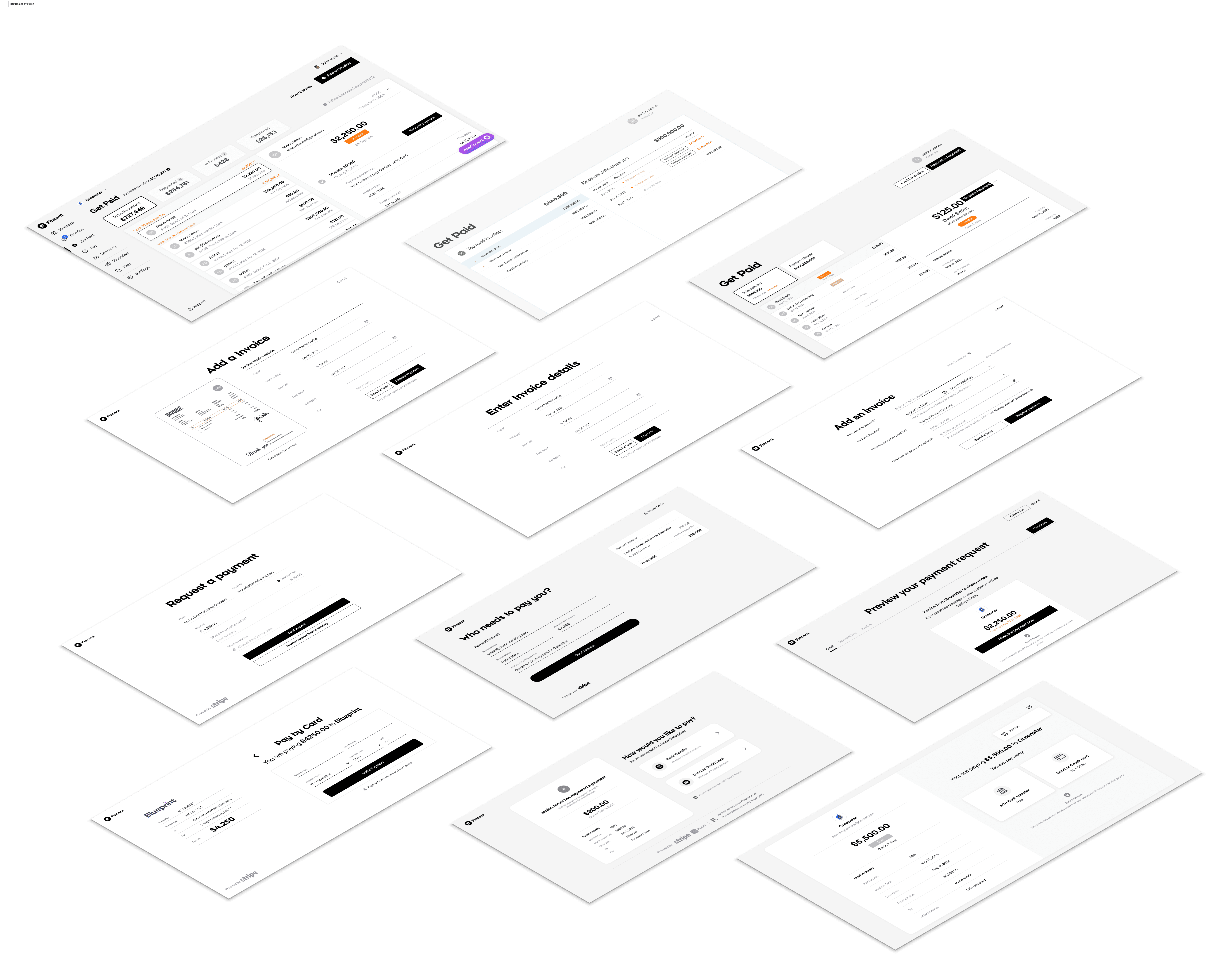
Design ideation, wireframes & iterations
I worked closely with a co-founder and product manager to brainstorm ideas. We did a lot of whiteboard exercises, tested the designs with internal stake holders. Here are the iterations of how the design evolved.
User testing and feedback
Here are some of the feedback we got after testing the initial designs with internal stake holders:
Include invoice number
Allow users to add attach documents such as form WC, contracts that are required to be paid
Allow users to send payment requests to multiple users
Allow users to add personal note
Mark a copy of payment request to themselves
Provide invoice preview
Design mock up
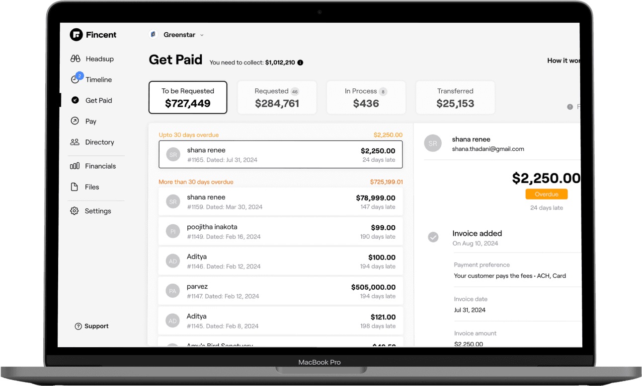
Invoices are grouped based on the statuses (To be requested, requested...) along with the amounts,
This gives users a quick snapshot of their financial situation without having to dig into details, making it easy for users to quickly take actions
Invoices that are to be requested are further grouped based on the due date, helping the user to know which one requires attention
Statuses are beautifully differentiated using colors (red, orange, grey and green) making it easy for users to remember
The activity (invoice details, who paid and when, when to expect payment, payment transferred) helps the user track the status of invoice payment requests.
Create & send invoice payment request
The form includes only the fields that are necessary to request payment, reducing cognitive load and making the process quicker for users.
The option to attach an existing invoice or have Fincent generate one automatically adds flexibility.
The ability to select or add a customer within the form ensures that users can manage their client interactions seamlessly.
Allowing users to change payment methods and decide who pays the processing fee directly within the invoice creation process is a user-centered approach.
The "Save for later" option acknowledges that users might not always have all the information or the time to complete the process in one go.
The ability to schedule payment requests for future dates is another thoughtful feature, recognizing the varying timelines that businesses work with.
Customer experience: Paying invoices easily
The design adopts a mobile first, clean and minimalist approach, focusing the user's attention on the essential elements. This simplicity helps to reduce cognitive load and makes the process of paying an invoice straightforward and intuitive.
Before making a payment, the user is shown a detailed preview, including the amount, payment methods, and any attached documents. This transparency ensures the user knows exactly what they are paying for, building trust in the process.
The final screen, which changes to indicate that the invoice has been paid, provides a clear and satisfying confirmation of the transaction's completion.
Desktop Experience
Challenges
Invoices are synced with Quickbooks. Some of the challenges and cases we had to consider were:
Handle partial payments made via quickbooks
Invoices that are sent for payment request gets updated or deleted in Quickbooks.
Architecture or database should support multiple line items, taxes and discounts in future
Any settings or preferences at an invoice level should be supported at business level
Payment failure and cancellation
Quickbooks should be connected and Payout account from stripe should be enabled to receive payments
Customer feedback, behaviour and insights
It was observed that users were creating invoices in advance and coming back to the system to request payment on due date, resulted in building a feature that allowed users to schedule payment request.
There was a demand for customization options, such as including a company logo on invoices.
Users needed a control over who pays the processing fees, either the sender or the recipient.
Some users used the system to only send requests and preferred settling of invoices outside Fincent, resulting in unpaid invoices staying in Fincent
No. of invoices created & requested between February to May is higher as compared to other months
Learning & Reflection
Gained deep insights into invoices creation and payment collection standards and norms in the USA
Learnt how invoices are created and stored in Quickbooks
Learnt how stripe can be used to receive payment
Conclusion
Increase in invoice creation: The number of invoices created grew steadily, because of the simplicity.
Improvement in payment collection: The rate of on-time payments improved dramatically, leading to better cash flow for businesses.
Enhanced user satisfaction: Users reported increased satisfaction with the invoicing process, highlighting its simplicity and efficiency.
Lower rate of overdue/unpaid invoices


